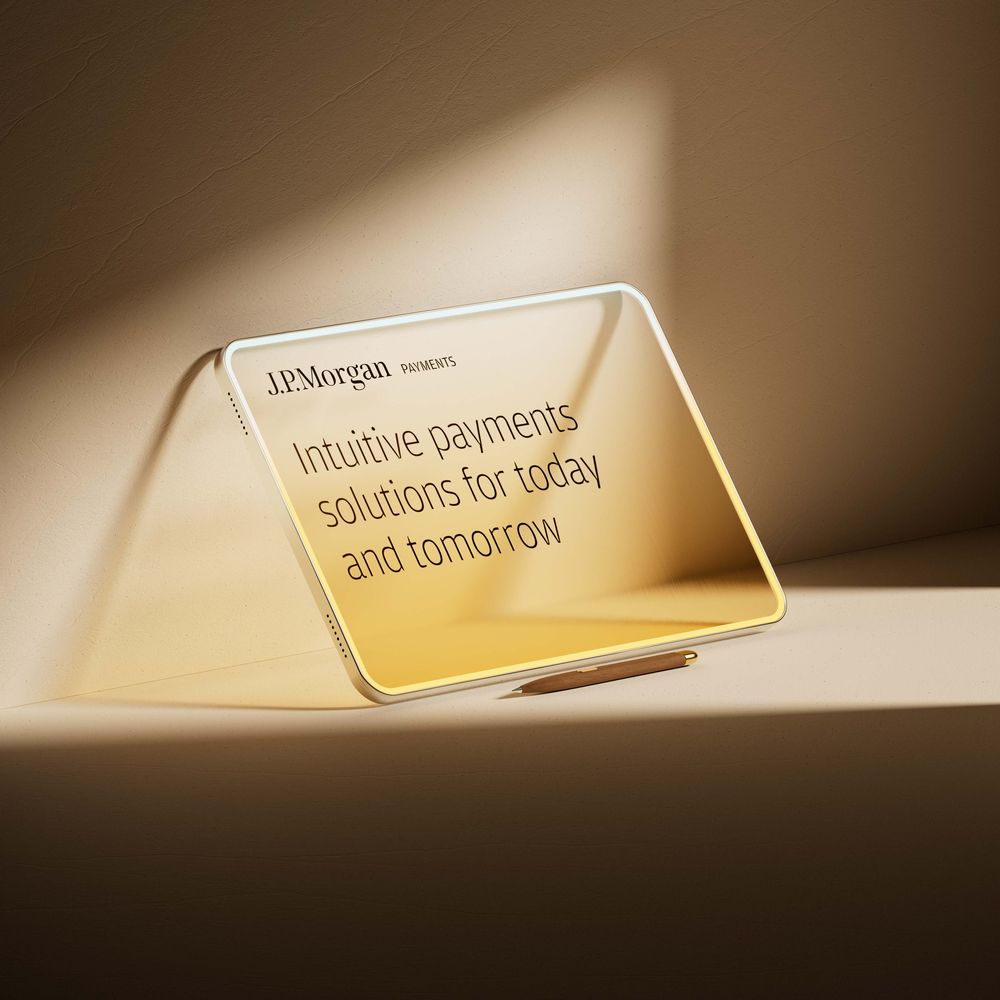
BUCK · Brand expression and campaigns · 2025 to 2026
J.P. Morgan Payments
A visual language for an institution with extraordinary reach. Fifteen projects, four studios and eight markets.
Role
Creative Director
Studio
BUCK, with Residence partners

BUCK · Brand expression and campaigns · 2025 to 2026
A visual language for an institution with extraordinary reach. Fifteen projects, four studios and eight markets.
J.P. Morgan Payments wanted an expression that felt more relevant to the business it had become. I saw an opportunity in the history and authority already attached to its name.
The question was how to make those qualities felt. Warm materials, considered typography and a clear sense of movement gave the team a way to express the brand’s confidence with more character. The client needed to recognize the institution in the work and see somewhere new it could go.
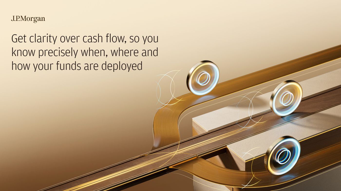
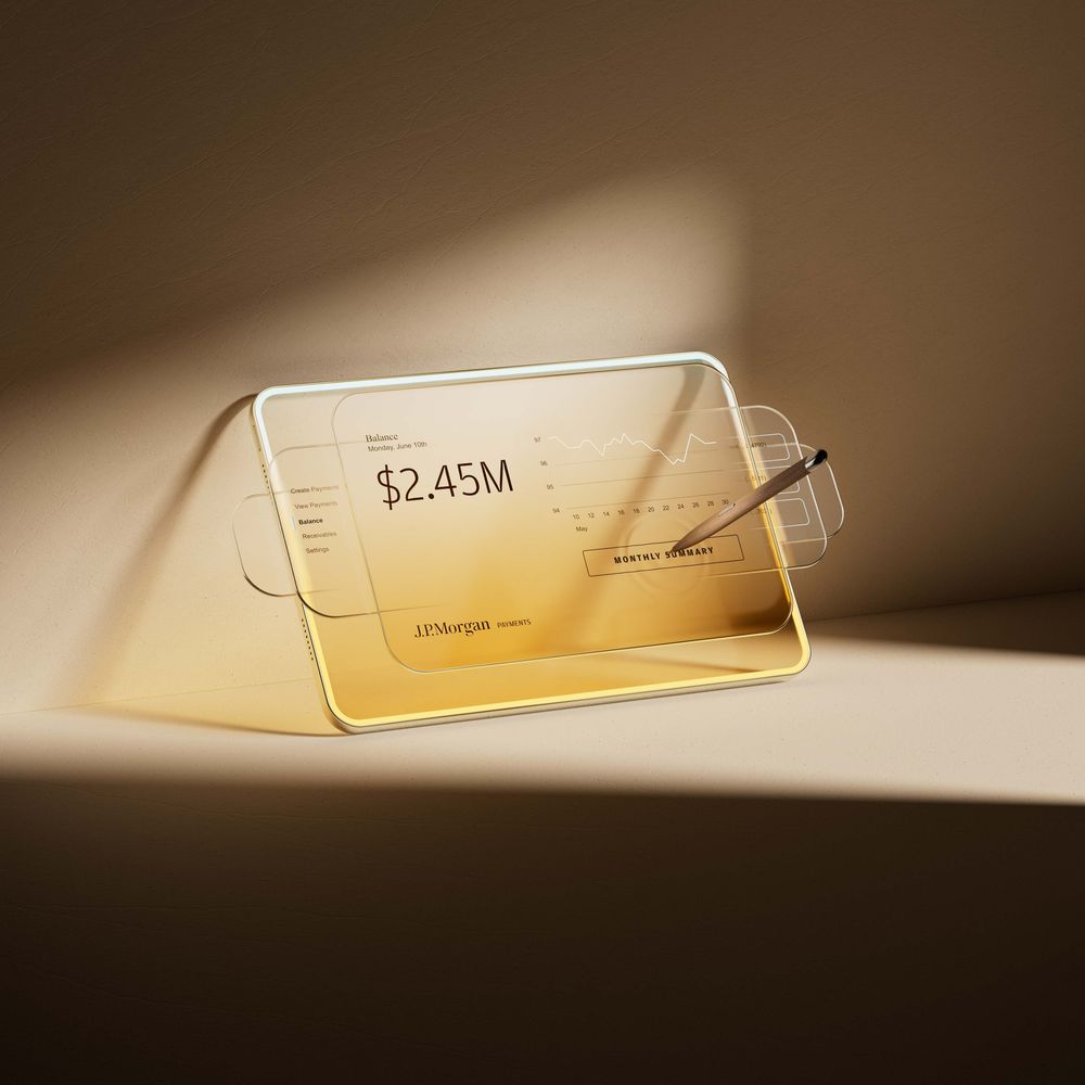
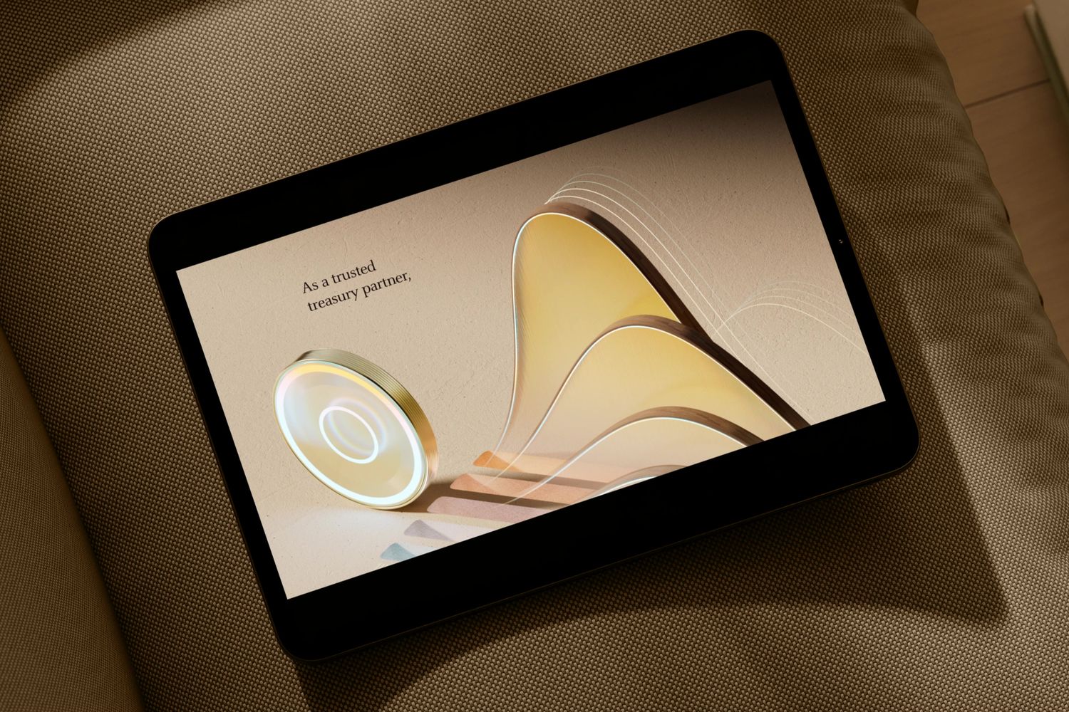
I chose the coin because it could carry several meanings without becoming a different object each time. It could stand for a transaction, a data point or an exchange between people. Its material, arrangement and movement would do the storytelling.
My team developed the imagery across ten solution territories, from treasury and cross-border payments to digital experiences and trust. That gave the brand a consistent starting point with room for each subject to have its own expression.
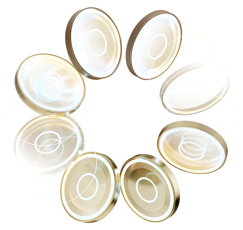
The coin was one part of a broader language. Color, type, linework, graphic imagery, photography and motion each needed a clear role, with enough reasoning behind them that teams could develop new work with confidence.
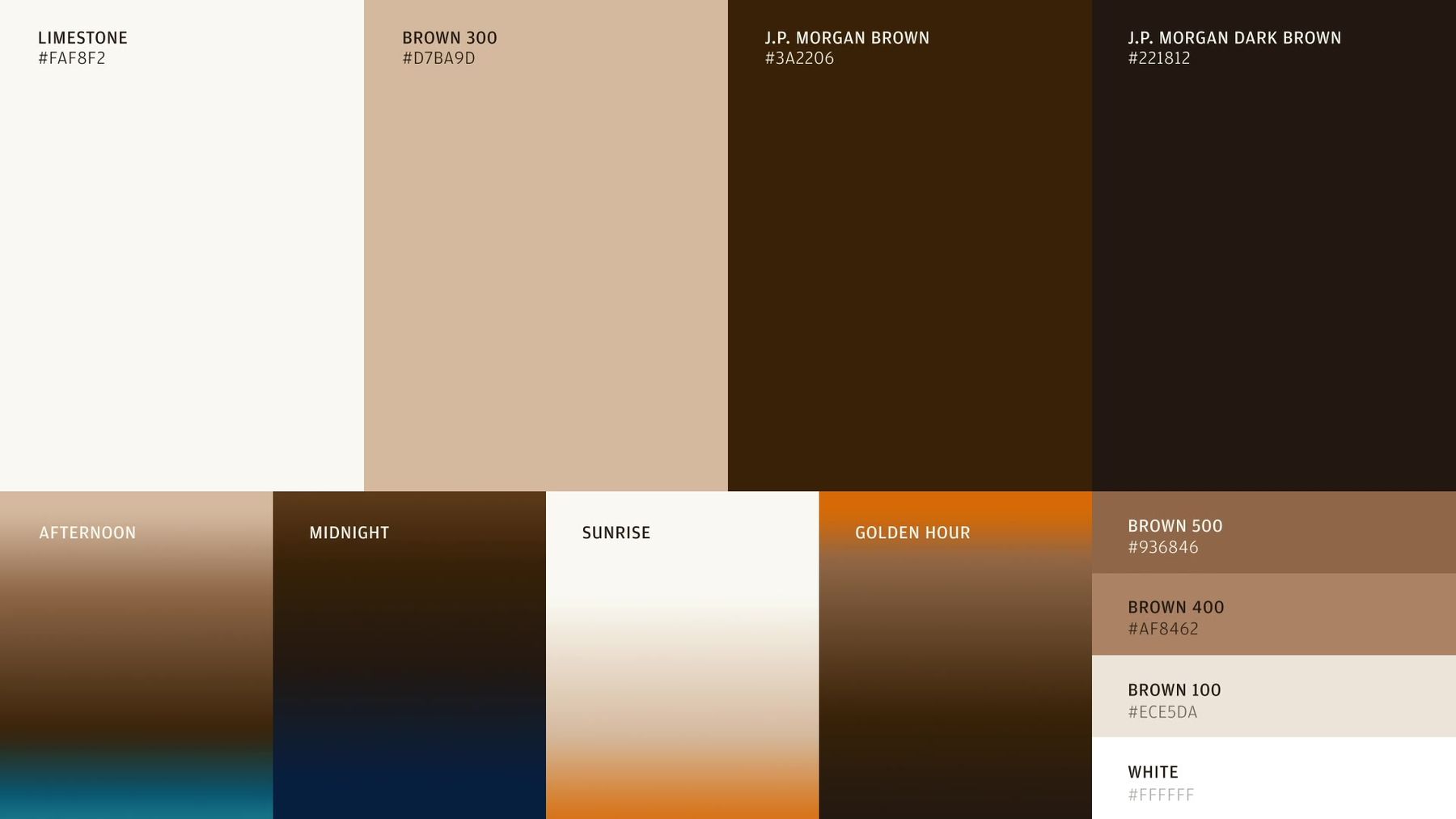
Color and type
The brown was already part of the brand. I pushed its use and reconsidered the balance between serif and sans serif, giving the existing identity more presence.
Linework
Layered geometry gave the movement of money a graphic expression. The team specified how it worked so it could be drawn and applied consistently.
Graphic imagery
I established the materials and how they should behave. The 3D team explored their use across the different solution territories.
Photography
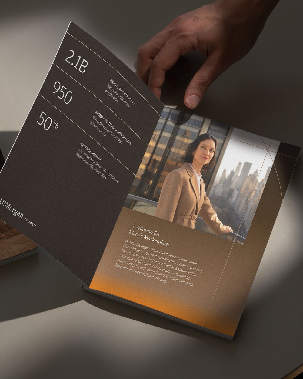
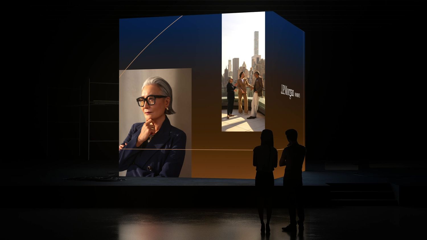
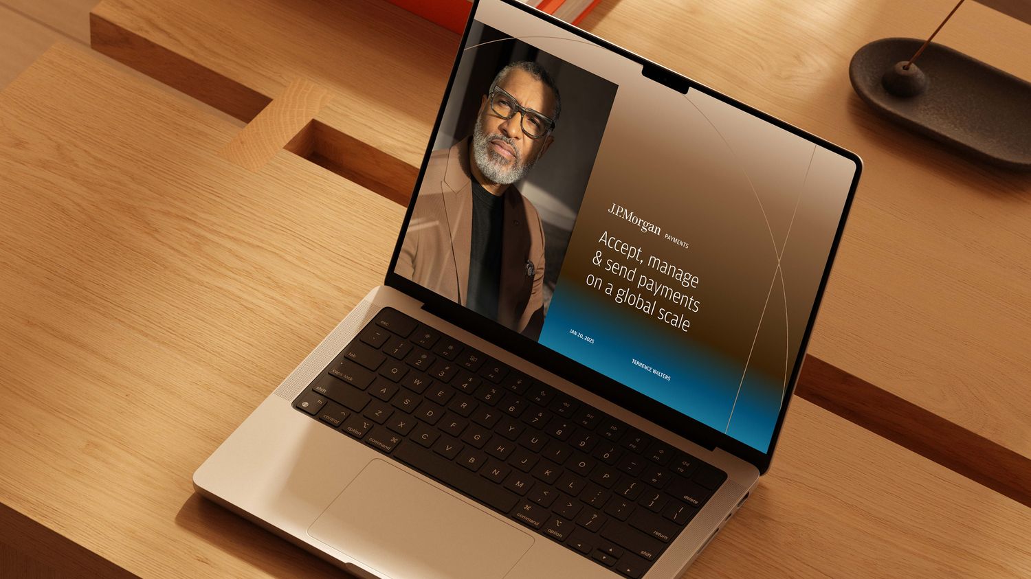
The direction centered on people and specific, believable moments, with work across North America, Latin America and the Middle East.
Motion
Movement began from a shared point of origin. That principle gave teams a common approach across typography, linework and imagery.
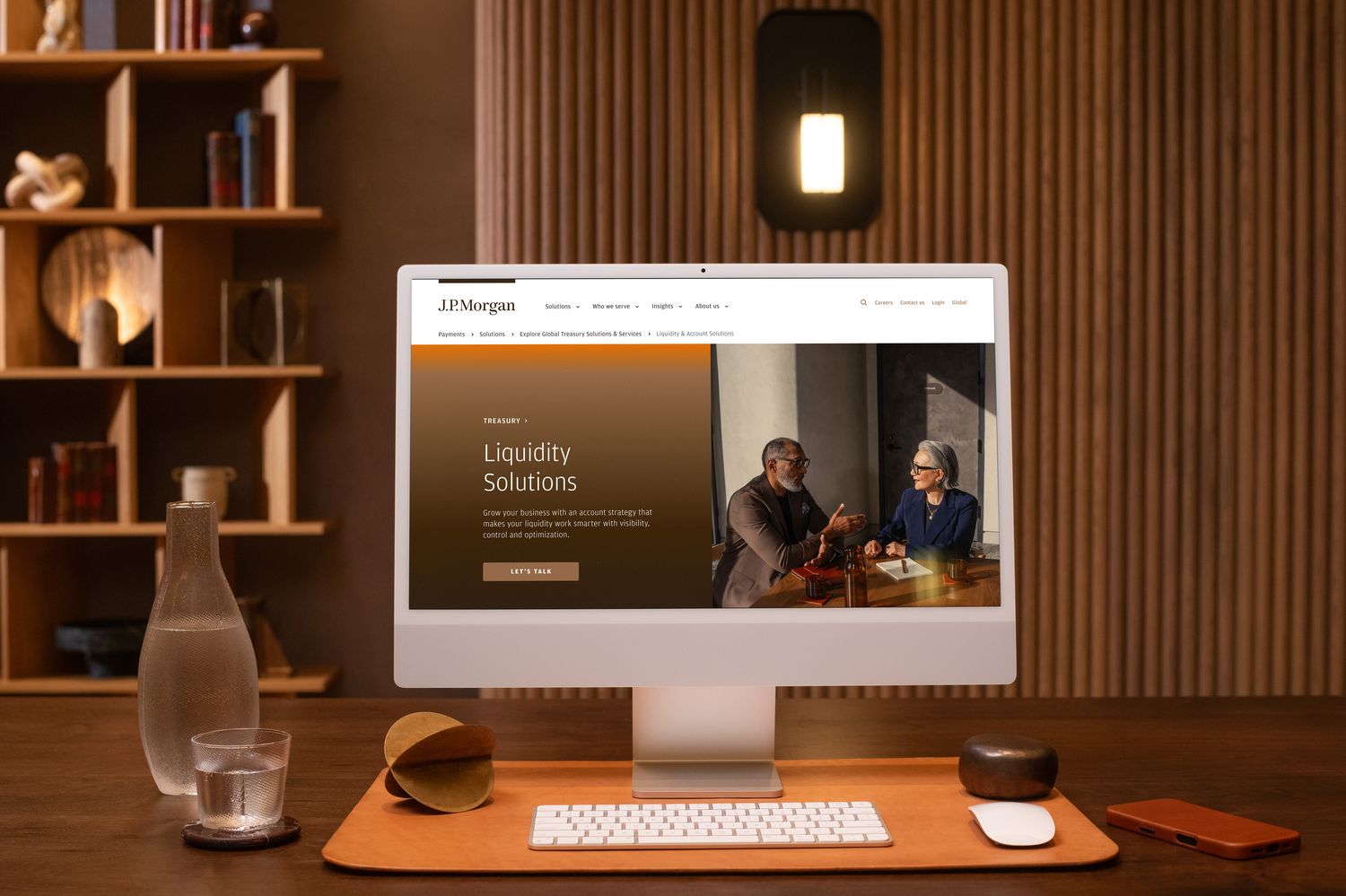
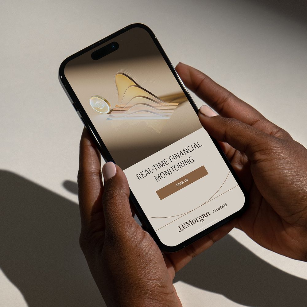
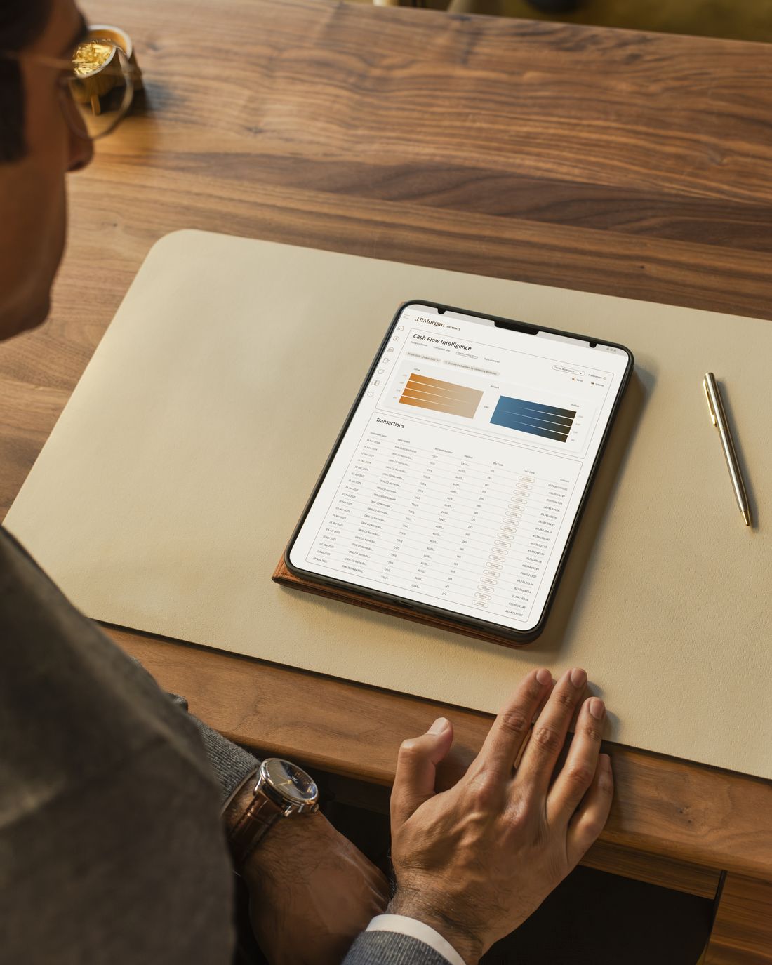
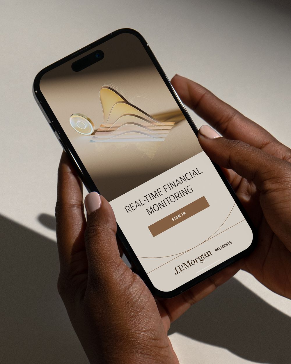
Photography, graphic imagery and the work in use, one world.






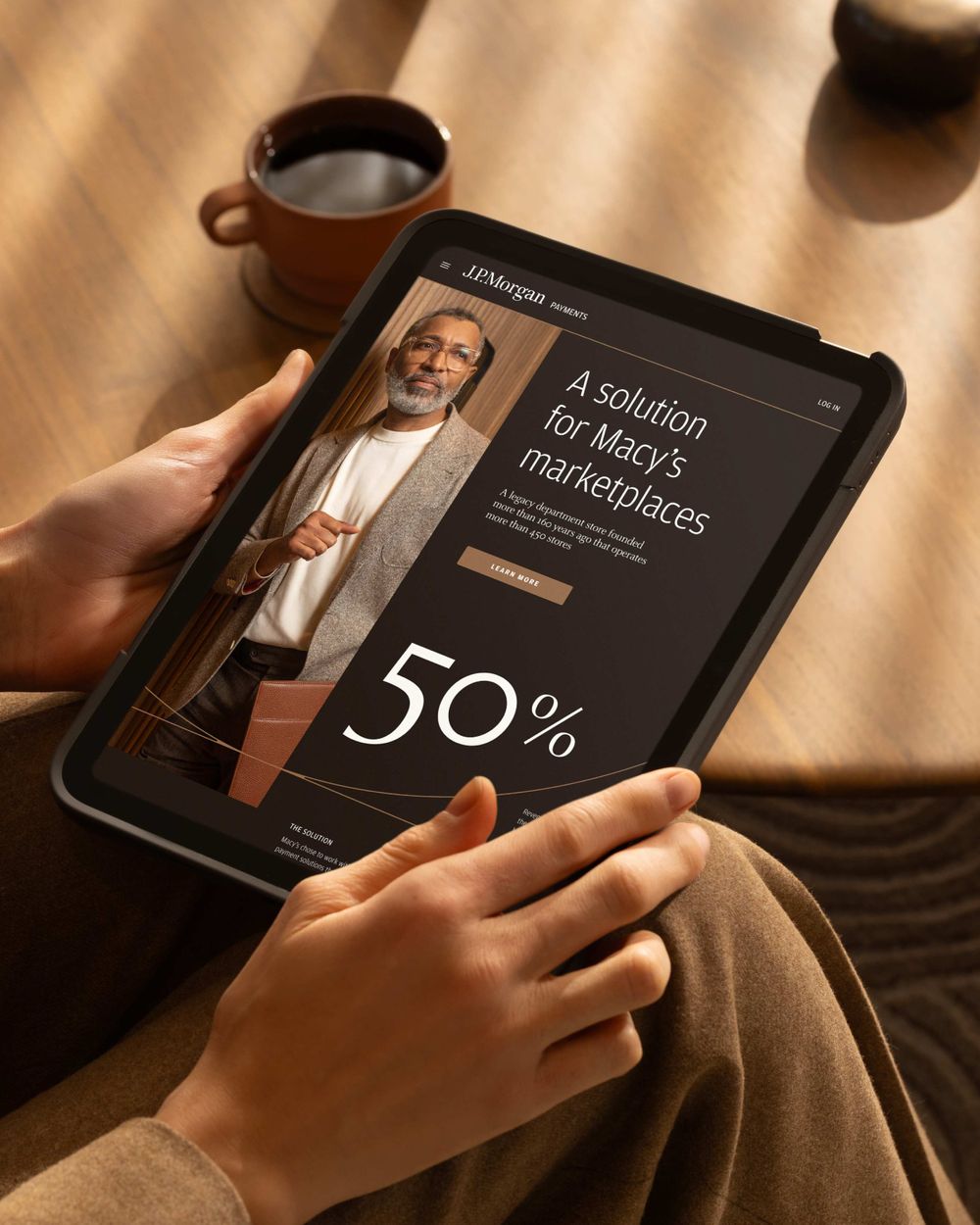
The creative direction needed evidence beyond the preferences of the people in the room. Part and Sum brought audience research into the process, helping test the expression with the people it was intended to reach.
Later, for the Treasurer’s Innovation Campaign, my team developed three concepts into boardomatics with color, music and voiceover. With Part and Sum, those concepts were developed and tested in two and a half weeks. The client could respond to an experience of the idea while there was still room to make a different decision.
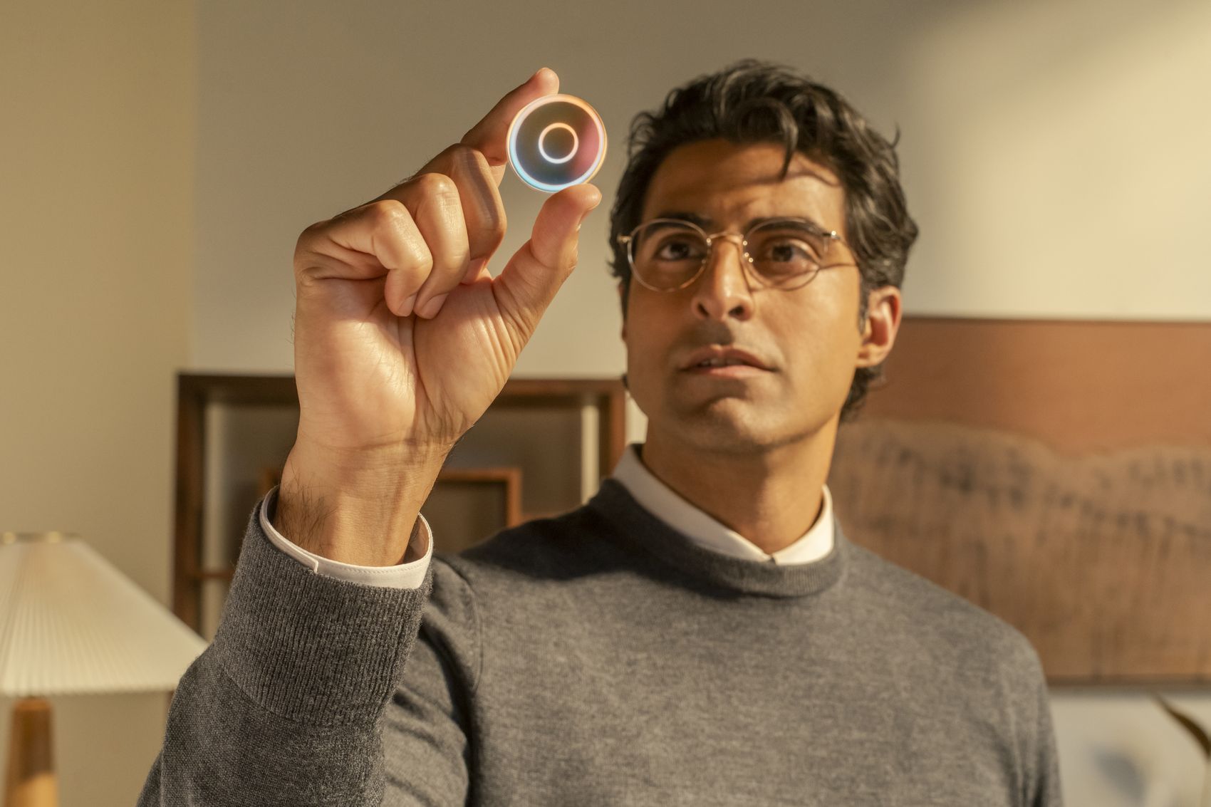
Bringing the coin into the real world.
I wanted the coin to become something a person could hold. The campaign brought it into real settings with people, extending the imagery into a more human story about payments.




Four studios, seven BUCK departments and teams inside J.P. Morgan Payments contributed to the work. I set the creative direction and guided the look across all of them, from research and campaigns to web, installations, photography and reports.
Each partner brought its own expertise and its own way of working. I stayed close to every stream, reviewing the work as it developed and giving each team the reasoning behind the choices, so everything they made belonged to the same brand.
Training and shared guidance carried that reasoning to people inside the client, so the next assignment could start from the same thinking.
The expression held up with the people it was made for and with the teams who had to use it. It reached eight markets and carried into reports, platforms, campaigns and physical spaces. What began with a launch film became fifteen projects.
250+
Clients involved in validation
50+
Internal training sessions
8
Markets